
Matplotlib is one of the oldest scientific visualization and plotting libraries available in Python. While it's not always the easiest to use (the commands can be verbose) it is the most powerful. Virtually any two-dimensional scientific visualization can be created with Matplotlib. The expansive example gallery shows the wide variety of images that can be generated with Matplotlib.
The highly publicized first images of a black hole where produced with Matplotlib.

Axes should not be confused with axis. An Axes is the area of the plot containing the lines/points/markers of data. Axis are the coordinate axis of the plot. See the figure for reference.
A Matplotlib plot contains
One or more
Axeswhich each contain an individual plotA
Figurewhich is the final image containing one or more Axes
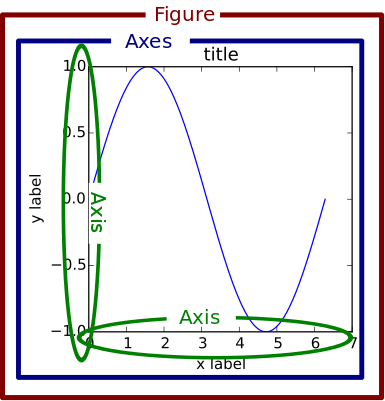
Axes are what are traditionally thought of as the area of the plot. These can contain the actual coordinate axis and tick marks, the lines or line markers for the data being plotting, legend, title, axis labels, etc. The Figure can contain more than one Axes. These Axes could appear side-by-side or in a grid, or they can appear essentially on top of one another where they share an $x$ or $y$ axis. The Figure can also contain a color bar in a contour or surface plot and a title.
The following figure taken from the Matplotlib FAQ is useful reference identifying the different parts of a two-dimensional plot.

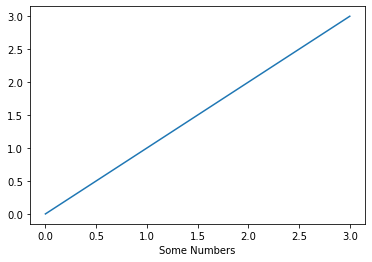
The easiest way to learn Matplotlib is with illustrative examples. In this example we'll instantiate Figure and Axes objects with matplotlib.pyplot.subplots. Then add some data and a label to the Axes.
import matplotlib.pyplot as plt

fig, ax = plt.subplots()

ax.plot([0, 1, 2, 3])
ax.set_xlabel("Some Numbers");
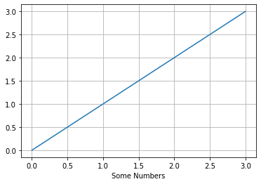
There are many options for changing the plot style. You have ultimate control over the entire look and feel. In the example below, we only add grid lines; however, you can adjust major and minor tic marks on the axis, change fonts, remove an axis or the entire frame, add a title, etc. With the Artist class, you can add annotations and adjust colors, basically you have full control over anything that can be rendered on the canvas.
fig, ax = plt.subplots()

ax.plot([0, 1, 2, 3])
ax.set_xlabel("Some Numbers");
ax.grid()
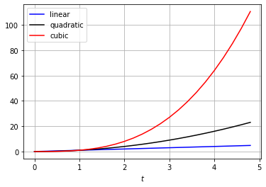
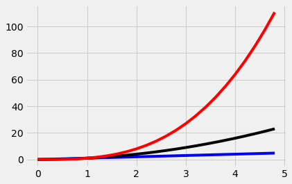
In the previous example, we input data as a Python list for plotting. However, Matplotlib has full support for using NumPy arrays as input data for plots. The following example illustrates the use of NumPy. First, we create a list of numbers ranging from $0$ to $5$ in steps of $0.2$ to be used as the independent variable $t$ in the plot. Then we plot linear, quadradic, and cubic polynomials as a function of $t$.
import numpy as np

t = np.arange(0,5,0.2)

fig, ax = plt.subplots()
ax.plot(t, t, 'b', label='linear')
ax.plot(t, t ** 2, 'k', label='quadratic')
ax.plot(t, t ** 3, 'r', label='cubic')
ax.set_xlabel(r'$t$')
ax.grid()
ax.legend();
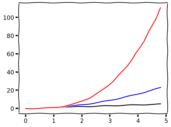
Matplotlib has several built in "styles" that add some default design styling to background colors, fonts, and line colors, etc.
This example uses the style 'fivethirtyeight' which is based on a style made popular by Nate Silver's FiveThirtyEight website.
import matplotlib

matplotlib.style.use('fivethirtyeight')

t = np.arange(0,5,0.2)
fig, ax = plt.subplots()

ax.plot(t, t, 'b')
ax.plot(t, t ** 2, 'k')
ax.plot(t, t ** 3, 'r');
There is even a style meant to mimic the drawing style of the popular web comic XKCD. While it may seem superfluous that this style is included in Matplotlib, it can actually be a useful style if you are trying to indicate trends between variables, but want to remove any notion that the dataset being plotted is real.
Because it's unlikely that you would ever want to use this style for more than a few plots, it's recommended to place the plotting code under a with statement which will cause this styling to only be utilized on the code within its indentation block.
with plt.xkcd():
    fig, ax = plt.subplots()
    ax.plot(t, t, 'k', t, t ** 2, 'b', t, t ** 3, 'r');
Every style available in the Python/Matplotlib environment you are working in is available with the matplotlib.pyplot.style.available command.
plt.style.available
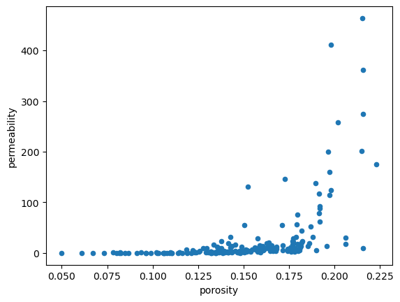
We've already seen how Pandas has a built in plot command. However, sometimes we want more control over how the plot looks. We can pass an Axes object to Pandas as an argument, then add any additional styling we desire. To demonstrate this, let's use Pandas to create a scatter plot with the default settings.
import pandas as pd
df = pd.read_csv('datasets/200wells.csv')
df.plot(x='porosity', y='permeability', kind='scatter');
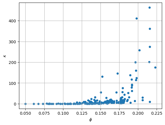
Now we will use the same plot command, but pass a Matplotlib Axes object as a keyword argument to Pandas plot. The we can easily add grid lines and change the labels to symbols using standard Matplotlib commands.
fig, ax = plt.subplots()
df.plot(x='porosity', y='permeability', kind='scatter', ax=ax)
ax.set_xlabel(r'$\phi$')
ax.set_ylabel(r'$\kappa$')
ax.grid()
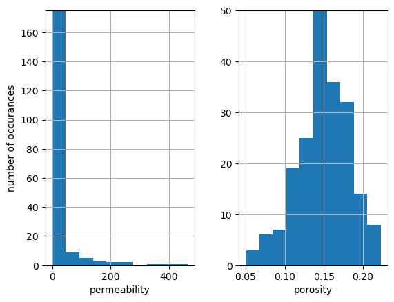
As an additional example, we'll use Pandas to create a histogram of the porosity and permeability values. This time we'll start with a subplot with one row and two columns. This will return a tuple containing two axes objects corresponding to permeability and porosity respectively. We then add some labels and set axis limits.
fig, ax = plt.subplots(nrows=1, ncols=2)
#
df[['porosity', 'permeability']].hist(bins=10, ax=ax)
ax[0].set_title('')
ax[0].set_xlabel('permeability')
ax[0].set_ylabel('number of occurances')
ax[0].set_ylim([0,175])
#
ax[1].set_title('')
ax[1].set_xlabel('porosity')
ax[1].set_ylim([0, 50]);
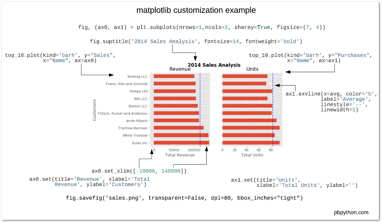
Below is a nice reference bar chart that was created from a Pandas DataFrame. The DataFrame is stored in the variable top_10. All of the commands that customize the plot are shown.
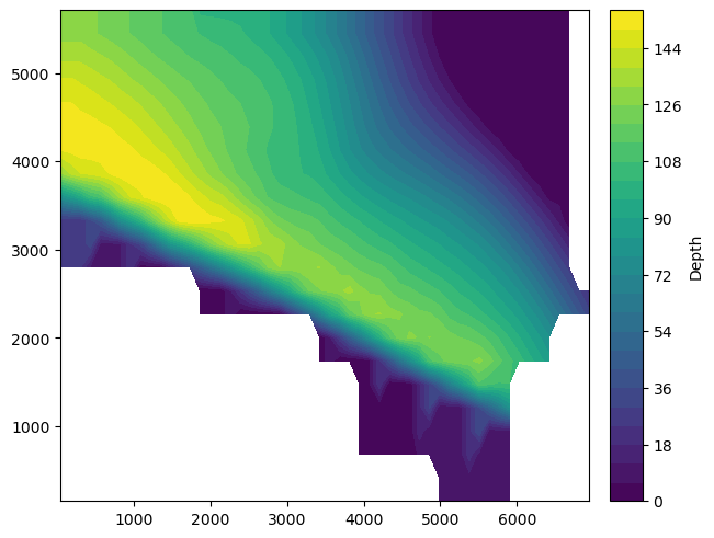
The following is an example of a filled contour plot in Matplotlib using the command contourf. If you prefer a contour plot with contour lines, see the function contour. This figure shows the depth of a petroleum reservoir.
Contour plots must have data that is defined on a rectangular grid in the $(x, y)$ plane. In the example below, the file nechelik.npy has already been organized in this way. Scattered data must be interpolated onto a rectangular grid. Any data that has the format of a floating point NaN (np.nan in NumPy) will be shown as white space in the contour plot.
X, Y, Z = np.load('datasets/nechelik.npy')

fig, ax = plt.subplots(constrained_layout=True)
C = ax.contourf(X, Y, Z, levels=30)
cbar = fig.colorbar(C)
cbar.ax.set_ylabel('Depth');
The following example is a surface plot created with the plot_surface from the mplot3d module within Matplotlib. We must first replace the np.nan values with $0$ to get the figure to display correctly. If working in a Jupyter Notebook, the command %matplotlib notebook will allow for some interactivity with the figure such as rotating the display.
%matplotlib notebook
from mpl_toolkits import mplot3d

fig = plt.figure()
ax = plt.axes(projection='3d')

Z[np.isnan(Z)] = 0.0

S = ax.plot_surface(X, Y, -Z, cmap='viridis', edgecolor='none')
cbar = fig.colorbar(S)
cbar.ax.set_ylabel('Depth');
Bokeh is a modern plotting library that is best used for creating interactive two-dimensional visualizations that are intended to be displayed in Jupyter Notebooks and/or HTML web sites. It has a simple interface that allows for quickly creating great looking figures.
Holoviews is a plotting package with a similar interface to Bokeh, but allows you to chose the backend to be either Bokeh (best for web) or Matplotlib (best for print publications) from a unified front end.
Plotly is another modern plotting library primarily targeting web-based visualizations and offers built in dashboarding capabilities.
Altair, the newest of the group, is based on Vega-Lite, a Javascript visualization grammar similar to the Grammar of Graphics implementation in the R programming language.
Further Reading
Further reading on Matplotlib can be found in the official documentation.